Build a reusable search engine for floating panels in SwiftUI

This article is the final of a three-part series on building a custom floating panel component for SwiftUI. If you haven't read the first part, you can find it here.
In this article, we'll finish the floating panel saga by building a reusable search engine and interface to be used with a panel. This builds upon the component built on the last tutorial, so make sure you have it at hand.
The code ahead also makes heavy use of Swift generics, so it might be wise to have a stronger grasp at them before reading.
The foundations
To start, we'll first declare the structures needed for the search mechanisms:
SearchItem: a protocol for a search items, which should contain a name, used for filtering, and a section.SearchItemSection: a simple struct that describes a section of search items.
We'll define them here:
import SwiftUI

/// The protocol to a searchable item in a ``FloatingPanelSearchLayout``. It can be filtered by its name.
public protocol SearchItem: Identifiable, Equatable {
    var id: ID { get }
    var name: String { get }
    var section: SearchItemSection { get }
}

/// A section for a ``SearchItem``
public struct SearchItemSection: Identifiable, Equatable, Hashable {
    public init(name: String) {
        self.name = name
    }

    public let id = UUID()
    var name: String
}
The layout
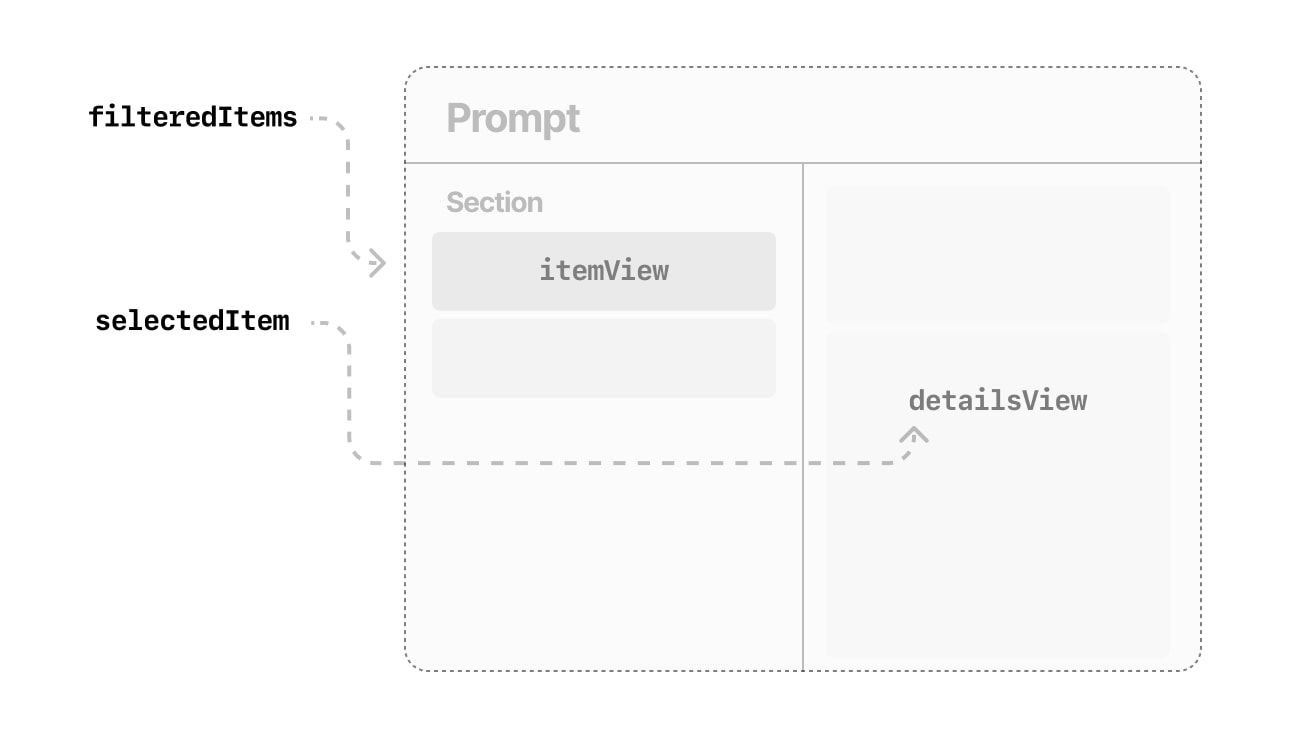
Now we head to the layout. As a roadmap, here's a small mockup of what we're doing:

Essentially, the toolbar will show an input field for searching, the leading side of the panel will show a list of the filtered, selectable items and the trailing side of the panel will show details of the selected item.
/// This SwiftUI view works as a blueprint for searchable lists inside a `FloatingExpandableLayout`.
public struct FloatingPanelSearchLayout<Item: SearchItem,
                                        ItemView: View,
                                        DetailsView: View>: View {
	let items: [Item]

    @ViewBuilder let itemView: (Item, Binding<Item?>) -> (ItemView)
    @ViewBuilder let detailsView: (Binding<Item?>) -> (DetailsView)

    var prompt: String = "Browse"
}
In the declaration above, the generic type Item is an implementation of SearchItem, and we get an array of that. The itemView and detailsView parameters are the closures for the views of the items in the list, and the selected item in the detail view, respectively, returning the corresponding generic view types.
itemViewaccepts two parameters: the actual item it's going to show and a binding to the current selection, which might benil.detailsView: accepts one parameter: a binding to the currently selected item, which might benil.
prompt is just the placeholder string for the search box. The view above can be initialized as so:
FloatingPanelSearchLayout(items: items, itemView: { item, selection in
    // Item view
}, detailsView: { selection in
    if let item = Binding(selection) {
        // Detail view
    }
}, prompt: "Browse items")
Now, let's go ahead and define our state variables.
@State var query = ""
@State var selectedItem: Item?
The query variable stores the search terms, and selectedItem stores the currently selected item from the sidebar.
Now, let's define some helper functions inside our view that will be used throughout our tutorial.
/// Returns the unique sections from all the items
var sections: [SearchItemSection] {
    var unique = [SearchItemSection]()
    for section in items.map({ $0.section }) {
        if !unique.contains(section) {
            unique.append(section)
        }
    }
    return unique
}

/// Returns all items, filtered by the query
var filteredItems: [Item] {
    if query.isEmpty {
	    // Don't filter if the query is empty
        return items
    } else {
        return items.filter({
			// Filter by name and section name, insensitively to text case
            $0.name.range(of: query, options: .caseInsensitive) != nil || $0.section.name.range(of: query, options: .caseInsensitive) != nil
        })
    }
}

/// Returns all filtered items associated with a section
func filteredItems(in section: SearchItemSection) -> [Item] {
    filteredItems.filter({ return $0.section == section })
}
Starting with the SwiftUI body, we'll be using the FloatingPanelExpandableLayout struct created in the last tutorial. For the toolbar, let's create a TextField and tie it to our query string. And for the content view, let's just display the raw detailsView while passing in the current selection.
var body: some View {
    FloatingPanelExpandableLayout(toolbar: {
        TextField(prompt, text: $query)
            .textFieldStyle(.plain)
            .font(.system(size: 26, weight: .regular))
            .onChange(of: query) { _ in
                // Whenever the query updates, update the selected item too
                selectedItem = filteredItems.first
            }
    }, sidebar: {
        // Sidebar content
    }, content: {
        detailsView($selectedItem)
    })
}
The sidebar
The sidebar is probably the biggest component of our view. It will consist of two nested loops, one for the sections, and, inside each section, one for the items, if there are any, in a scroll view. Let's see how this will work:
ScrollView {
    VStack {
        ForEach(sections, id: \.self) { section in
            let items = filteredItems(in: section)

			// Only show section if it has any items
            if !items.isEmpty {
				// Checks if selection is within section
                let selected = section == selectedItem?.section

                VStack(alignment: .leading) {
					// Section title
                    Text(section.name.uppercased())
                        .font(.system(size: selected ? 15 : 14, weight: .bold))
                        .foregroundStyle(selected ? .secondary : .tertiary)
                        .frame(height: 15, alignment: .bottomLeading)
                        .padding(.top, 8)

					// Section items
                    ForEach(items) { item in
                        itemView(item, $selectedItem)
                            .accessibilityElement()
                            .accessibility(label: Text(item.name))
                            .accessibilityAction {
                                selectedItem = item
                            }
                    }
                }
            }
        }
        Spacer()
    }
    .padding([.horizontal, .bottom], 16)
    .padding(.top, 8)
}
.onAppear {
    selectedItem = filteredItems.first
}
.animation(.spring(response: 0.25, dampingFraction: 0.85), value: selectedItem)
There's quite a lot to unpack here, so let's start with the section title: it has a dynamic font size, that enlarges when the current selection is within the section. It also has a dynamic foreground style. The height is fixed to the larger font size so that the vertical size stays fixed. And it also has a top padding to keep distance from other sections.
The dynamic font size will automatically animate in macOS Ventura. If you are deploying for older macOS versions, make sure to check our article for a retroactive implementation.
Each item view is configured for accessibility actions, so that it's accessible regardless of what's within it. The whole VStack container has a horizontal and bottom padding of 16 points, as well as a top padding of 8 points to compensate for the section padding.
Apart from that, there is also a custom spring animation set for the selected item.
At last, shortcuts!
Of course, now there's only one step missing: shortcuts! Since we're displaying our items in a vertical list, we want to assign the up and down arrows to their respective commands. We'll do so using a SwiftUI hack.
First, we'll create a function that allows us to issue a safe "jump" action of any given length on the selected item.
func jump(amount: Int) {
    if let selectedItem = selectedItem {
        if let index = filteredItems.firstIndex(of: selectedItem) {
            if filteredItems.indices.contains(index) {
                self.selectedItem = filteredItems[index]
            }
        }
    } else {
        selectedItem = filteredItems.first
    }
}
And so, for the shortcuts, you need is a hidden view like this one and hide it to accessibility:
var shortcuts: some View {
    ZStack {
        Button(action: {
            jump(amount: 1)
        }, label: {})
            .keyboardShortcut(.downArrow, modifiers: [])

        Button(action: {
            jump(amount: -1)
        }, label: {})
            .keyboardShortcut(.upArrow, modifiers: [])
    }
    .opacity(0.0)
    .allowsHitTesting(false)
    .accessibilityHidden(true)
}
Then, all you gotta do is set it a s a background to the ScrollView.
.background(shortcuts)Here's what the final implementation looks like:
import SwiftUI

let brazil = SearchItemSection(name: "Brazil")
let sweden = SearchItemSection(name: "Sweden")
let us = SearchItemSection(name: "United States")

struct ContentView: View {
	let cities: [City] = [
        .init(name: "São Paulo", section: brazil),
        .init(name: "Rio de Janeiro", section: brazil),
        .init(name: "Florianópolis", section: brazil),
        .init(name: "Stockholm", section: sweden),
        .init(name: "Gothenburg", section: sweden),
        .init(name: "San Francisco", section: us),
        .init(name: "Boston", section: us),
    ]

    var body: some View {
        FloatingPanelSearchLayout(items: cities, itemView: { city, selection in
            GroupBox {
                Text(city.name)
            }.background {
                if city == selection.wrappedValue {
                    RoundedRectangle(cornerRadius: 8, style: .continuous)
                        .fill(.blue)
                }
            }
            .foregroundStyle(city == selection.wrappedValue ? .white : .primary)
            .onTapGesture {
                selection.wrappedValue = city
            }
        }, detailsView: { city in
            if let city = city.wrappedValue {
                Text("The currently selected city is \(city.name).")
            }
        }, prompt: "Browse cities")
    }
}

struct City: SearchItem {
    let id = UUID()
    let name: String
    let section: SearchItemSection
}
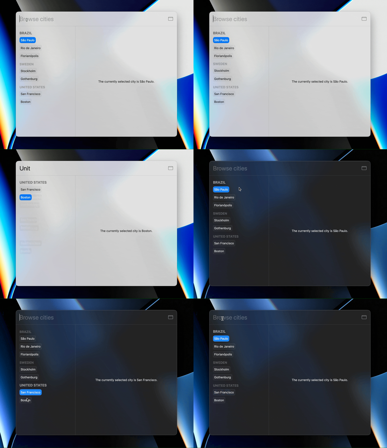
And here it is in action:
