Build an expandable interface for floating panels in SwiftUI
This article is the second one of a three-part series on building a custom floating panel component for SwiftUI. If you haven't read the first part, you can find it here.
The next step in building a floating panel experience with SwiftUI is, of course the view layout that goes in it. In this series, we're making a component similar to Xcode's Library (shift+command+L) that is:
- Expandable: has a leading sidebar, for a list, a trailing content view, and a top toolbar.
- Searchable: implements a reusable data structure that can be searched via a search bar at the top.
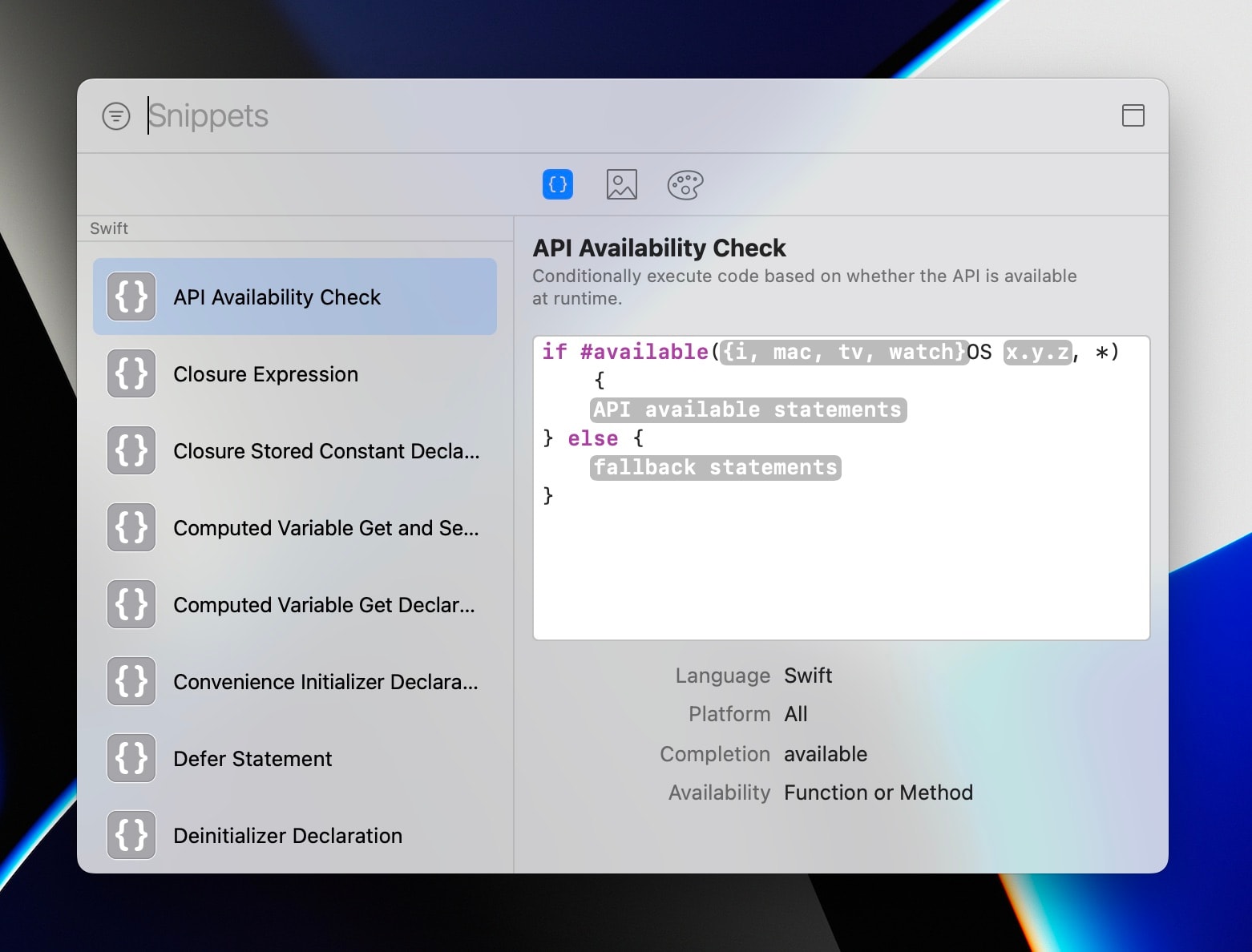
Let's split those two up, building the first part, the expandable layout, in this article.
FloatingPanelExpandableLayout
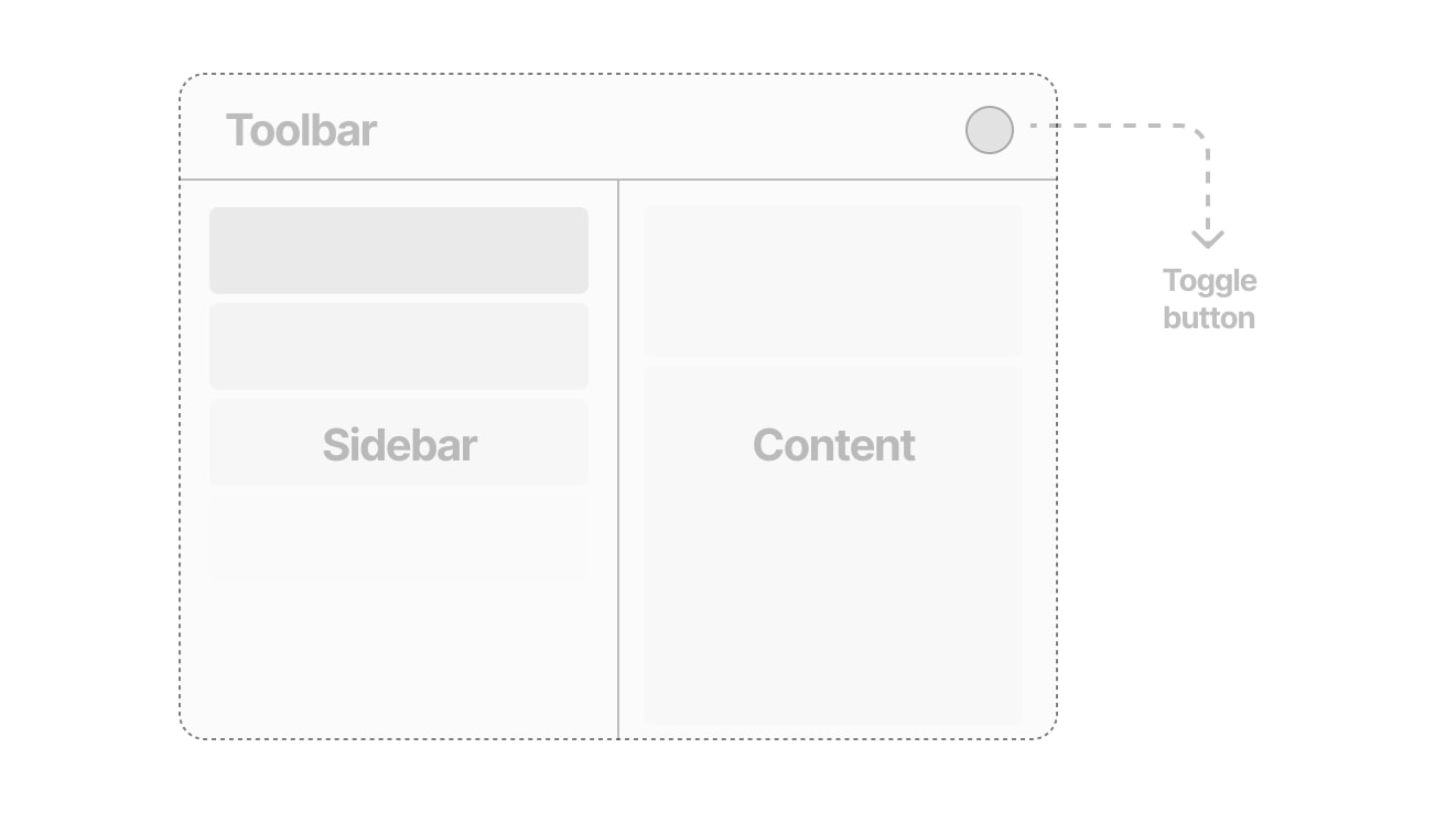
This view will declare the toolbar–sidebar–content structure we want our panel to have. It should look like this when expanded:
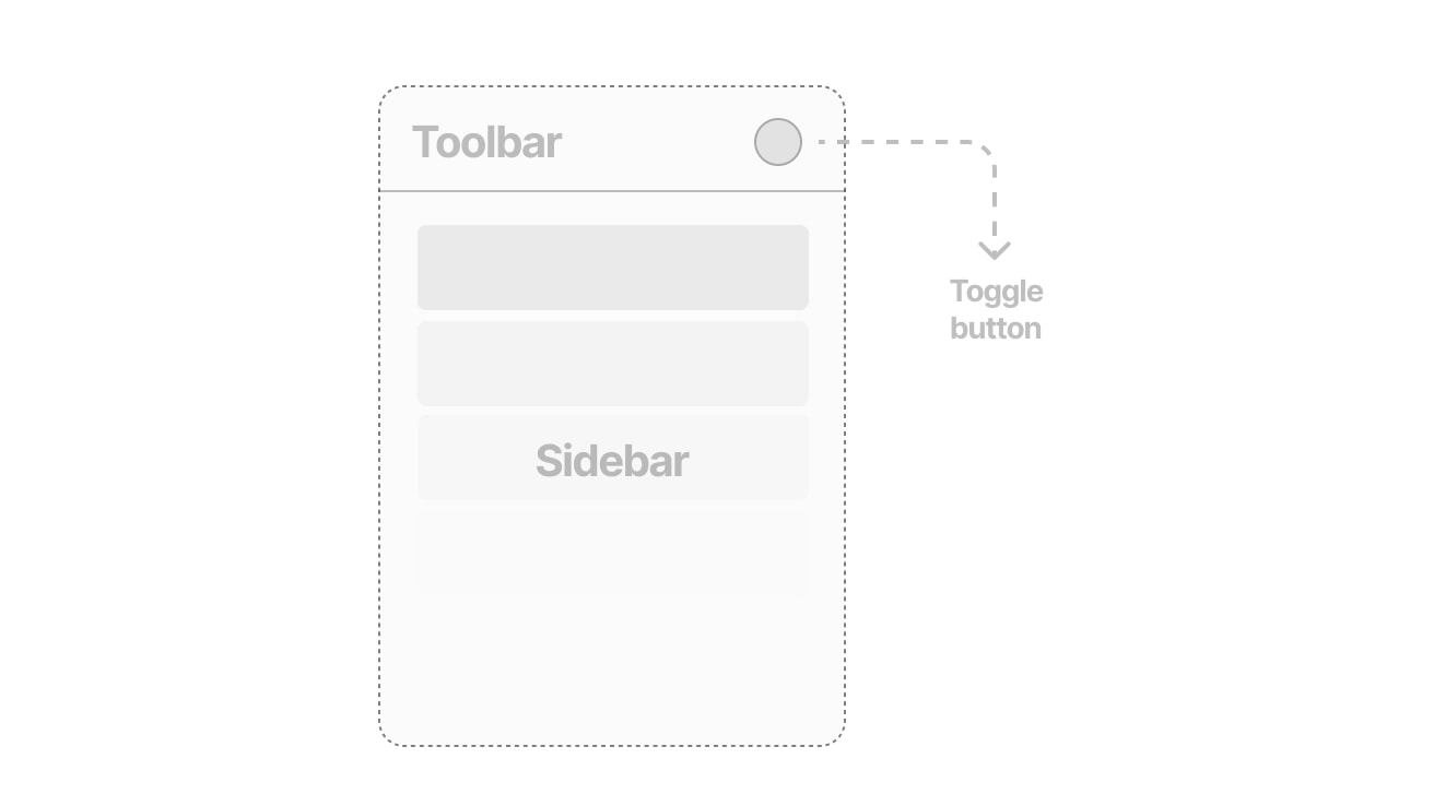
And like this when contracted:
A couple notes:
- The content view must be hidden if the width is not at least a certain amount.
- The sidebar view needs to have a minimum width.
- The visibility of the content view must be adjusted by a toggle that resizes the panel.
Great! Let's begin with the declaration of our view:
import SwiftUI

/// This SwiftUI view provides basic modular capability to a `FloatingPanel`.
public struct FloatingPanelExpandableLayout<Toolbar: View, Sidebar: View, Content: View>: View {
    @ViewBuilder let toolbar: () -> Toolbar
    @ViewBuilder let sidebar: () -> Sidebar
    @ViewBuilder let content: () -> Content

    /// The minimum width of the sidebar
	var sidebarWidth: CGFloat = 256.0
    /// The minimum width for both views to show
    var totalWidth: CGFloat = 512.0
    /// The minimum height
    var minHeight: CGFloat = 512.0

    /// Stores the expanded width of the view on toggle
    @State var expandedWidth = 512.0

    /// Stores a reference to the parent panel instance
    @Environment(\.floatingPanel) var panel
}
This view takes in three views of different generic types, and inside the body we will lay them out in a specific way. The view will not hold an expanded state explicitly – instead, the expanded state will be a consequence of the panel's width computed inside the view.
Let's start the body by displaying our VisualEffectView inside a ZStack.
public var body: some View {
    ZStack {
        VisualEffectView(material: .sidebar)

        /// Rest of the content
    }
    .frame(minWidth: sidebarWidth, minHeight: minHeight)
}
Next, let's wrap the stack inside a GeometryReader, because we'll need the width of the panel later.
public var body: some View {
    GeometryReader { geo in
        ZStack {
            VisualEffectView(material: .sidebar)

            /// Rest of the content
        }
    }
    .frame(minWidth: sidebarWidth, minHeight: minHeight)
}
Now, let's draw a vertical stack and the toolbar section:
public var body: some View {
    GeometryReader { geo in
        ZStack {
            VisualEffectView(material: .sidebar)

            VStack(spacing: 0) {
                /// Display toolbar and toggle button
                HStack {
                    toolbar()
                    Spacer()

                    /// Toggle button
                    Button(action: toggleExpand) {
                        /// Use different SF Symbols to indicate the future state
                        Image(systemName: expanded(for: geo.size.width) ?  "menubar.rectangle" : "uiwindow.split.2x1")
                    }
                    .buttonStyle(.plain)
                        .font(.system(size: 18, weight: .light))
                        .foregroundStyle(.secondary)
                }
                .padding(16)

                /// Add a visual cue to separate the sections
                Divider()

                /// Display bottom section
            }
        }
    }
    .frame(minWidth: sidebarWidth, minHeight: minHeight)
}
For the sake of simplicity, we'll be using SF symbols to indicate the state that will be triggered by the toggle button. “uiwindow.split.2x2” and "menubar.rectangle" do the job, but aren't perfectly analogous. For now though, they do help convey the idea of expansion and contraction.

Notice the reference of two undefined functions in the code, toggleExpand and expanded(for:). Let's define them now, inside the view:
/// Toggle the expanded state of the panel
func toggleExpand() {
    if let panel = panel {
        /// Use the parent panel's frame for reference
        let frame = panel.frame

        /// If expanded, store the expanded width for later use
        if expanded(for: frame.width) {
            expandedWidth = frame.width
        }

        /// If expanded, the new width should be the minimum sidebar width, if not, make it the largest of either the stored expanded width or the total width
        let newWidth = expanded(for: frame.width) ? sidebarWidth : max(expandedWidth, totalWidth)

        /// Create a new frame that centers the new width on resize
        let newFrame = CGRect(x: frame.midX-newWidth/2, y: frame.origin.y, width: newWidth, height: frame.height)

        /// Resize the parent panel. The view should resize itself as a consequence.
        panel.setFrame(newFrame, display: true, animate: true)
    }
}/// Since the expanded state of the view based on its current geometry, let's make a function for it.
func expanded(for width: CGFloat) -> Bool {
return width >= totalWidth
}Don't worry with understanding how toggleExpand works right now, but rather try to implement it in your codebase and see how it behaves. Notice how when the new frame is set, animate is set to true so that the transition is as smooth as it can be.
expanded(for:) works by comparing the widths and return a boolean value – no biggie here.
Now, let's draw the actual bottom part of the view, with the list and content views:
public var body: some View {
    GeometryReader { geo in
        ZStack {
            VisualEffectView(material: .sidebar)

            VStack(spacing: 0) {
                /// Display toolbar and toggle button
                HStack {
                    toolbar()
                    Spacer()

                    /// Toggle button
                    Button(action: toggleExpand) {
                        /// Use different SF Symbols to indicate the future state
                        Image(systemName: expanded(for: geo.size.width) ?  "menubar.rectangle" : "uiwindow.split.2x1")
                    }
                    .buttonStyle(.plain)
                        .font(.system(size: 18, weight: .light))
                        .foregroundStyle(.secondary)
                }
                .padding(16)

                /// Add a visual cue to separate the sections
                Divider()

                /// Display sidebar and content view
                HStack(spacing: 0) {
                    /// Display the sidebar and center it in a vertical stack to fill in the space
                    VStack {
                        Spacer()
                        /// Set the minimum width to the sidebar width, and the maximum width if expanded to the sidebar width, otherwise set it to the total width
                        sidebar()
                            .frame(minWidth: sidebarWidth, maxWidth: expanded(for: geo.size.width) ? sidebarWidth : totalWidth)
                        Spacer()
                    }

                    /// Only show content view if expanded
                    /// Set its frame so it's centered no matter what
                    /// Include the divider in this, since we don't want a divider lying around if there is nothing to divide
                    /// Also attach a move from edge transition
                    if expanded(for: geo.size.width) {
                        HStack(spacing: 0) {
                            Divider()
                            content()
                                .frame(width: geo.size.width-sidebarWidth)
                        }
                        .transition(.move(edge: .trailing))
                    }
                }
                .animation(.spring(), value: expanded(for: geo.size.width))
            }
        }
    }
    .frame(minWidth: sidebarWidth, minHeight: minHeight)
}
And this is it! Notice the transition set for the content view – it creates a nice effect when it expands. Also, check how we set the animation modifier to only act on the bottom scope. That means it does not affect the toolbar.
Our panel is ready to go. Let's present it like so and see what it outputs:
import SwiftUI

struct ContentView: View {
    @State var showingPanel = false

    var body: some View {
        Button("Present panel") {
            showingPanel.toggle()
        }.floatingPanel(isPresented: $showingPanel, content: {
            FloatingPanelExpandableLayout(toolbar: {
                Text("Toolbar")
            }, sidebar: {
                Text("Sidebar")
            }, content: {
                Text("Content")
            })
        })
    }
}
This is what the panel looks like now:
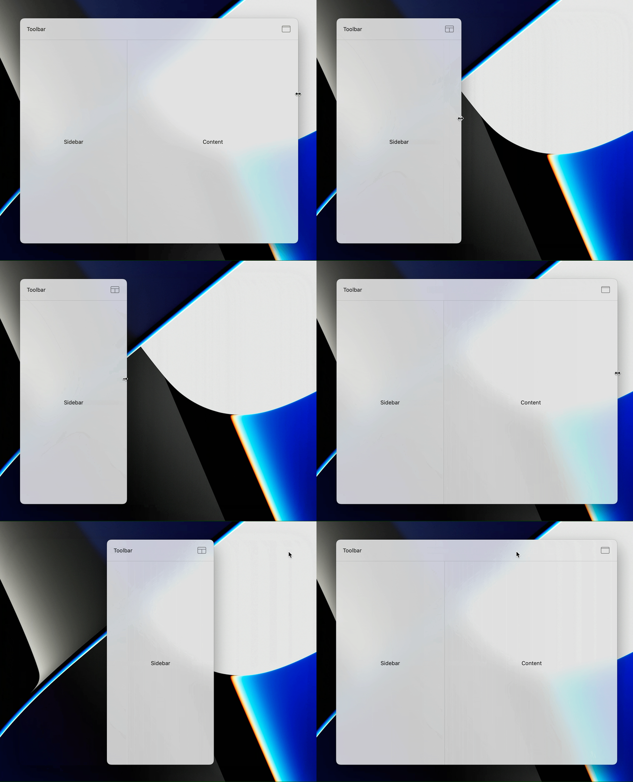
What we've done so far
Congratulations on building this! It's been quite a journey getting here. In this tutorial, we've created a layout that:
- Can be practically used for anything in SwiftUI;
- Integrates seamlessly with floating panels;
- Uses geometry to adapt itself in an intelligent way; and
- Interfaces with AppKit for resizing.
Our next step will be implementing the search bar, but part three awaits another day.
Thank you so much for reading through here!
Make sure to stay tuned to Cindori's blog for more, and have a good day!